Dashboard Creation in Excel
How to build your own Excel dashboard
Over 1.8 million professionals use CFI to learn accounting, financial analysis, modeling and more. Start with a free account to explore 20+ always-free courses and hundreds of finance templates and cheat sheets.
Creating a Dashboard in Excel
A good financial analyst needs to be a master of dashboard creation in Excel. It’s not always a skill that comes naturally to people, and practice, combined with good training, is the key to success. In this free guide, we’ve outlined the most important tips and tricks for creating a dashboard in Excel. Whether you are a beginner or advanced, you will find some important takeaways in this tutorial.
In order to create an effective Excel dashboard, we recommend the following steps:
- Organize your data
- Set up your page
- Brainstorm
- Select visuals
- Focus attention
- Tell a story
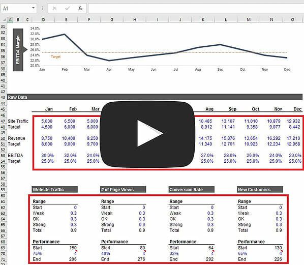
Step 1 – Organize your data
Before you begin your dashboard creation in Excel, it’s critical to have your data well organized. We always encourage analysts to use Excel modeling best practices, whether building financial models or preparing to design a dashboard.
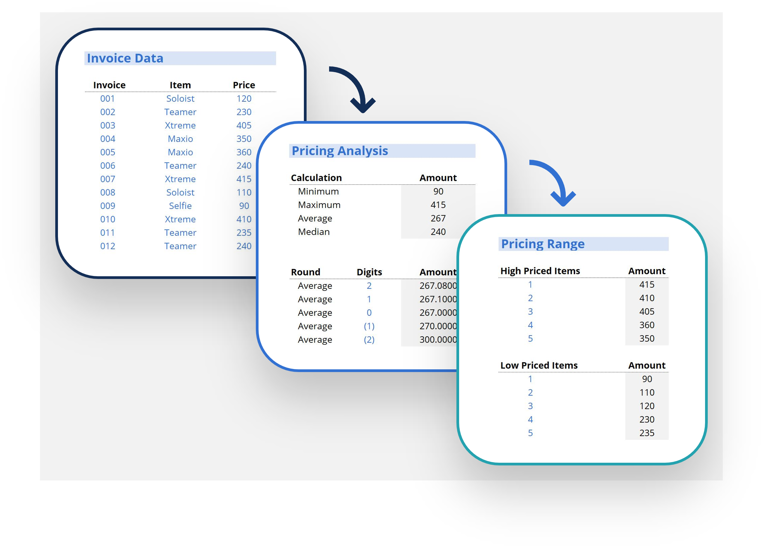
The most important part is to have all the information you plan on graphing in one area. It can be very hard to link the graphs if data is spread out throughout the spreadsheet. In the image below you can see an example of how to neatly organize your data from the financial model to be ready for the Excel dashboard.
Step 2 – Set up your page
Once your data is organized, it’s time to set up the page. The orientation can be landscape or portrait, and the size will depend on the output you’re trying to create. The most common is to make it an 8.5” by 11” page so that it can easily print to paper or PDF in a standard size. Typically, dashboards are only one page, but you can easily create a multi-page dashboard as well. To learn how to do this, see our free Excel tutorial course.
Important things to consider when setting up your page include: will the dashboard be emailed or printed, will it go to executives or lay people, is it for internal use or external use, and should the information be mostly visual or contain numbers and words as well.
For the purposes of this example dashboard, we will be using a 1-page 8.5 x 11 portrait page setup.
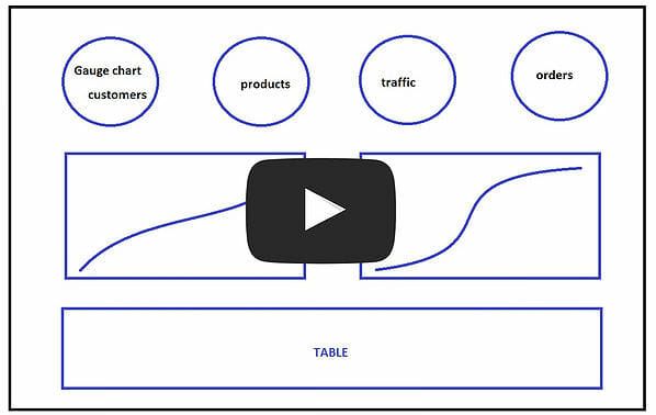
Step 3 – Brainstorm
It’s nearly impossible to design a dashboard right on the first try. You need to brainstorm, experiment, and tinker to finally come up with a great design. This step usually takes several iterations, and you may even find yourself continually changing and updating your Excel dashboard based on the feedback you receive over time.
Below is an example of some brainstorming that you can do before you actually begin the dashboard creation in Excel. Notice that it’s mostly just rough notes and ideas about how the page should be structured, and what type of data needs to be included. In the planning stage, we also recommend looking at other examples of dashboards to see what you like.
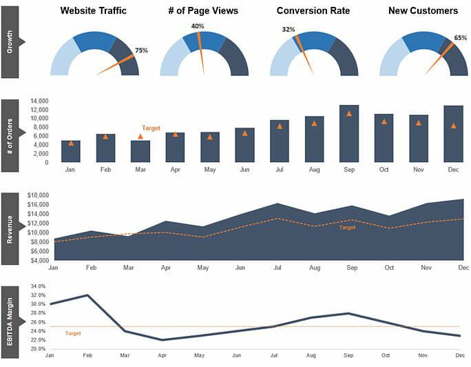
Step 4 – Select visuals
There are lots of visual options when it comes to designing a dashboard. In our course on dashboard creation in Excel, we go through all the various types of charts and graphs you can design in Excel, following our simple step by step approach.
Here are some of the most common visuals to use:
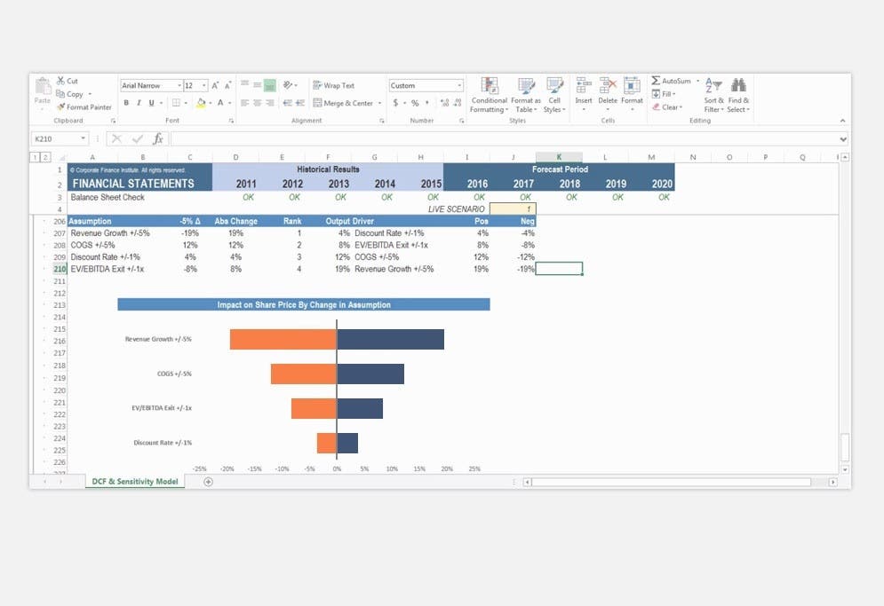
Combined Column and Line Chart
Learn how to build these charts in our Excel dashboards course.
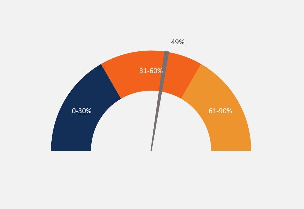
Gauge Charts
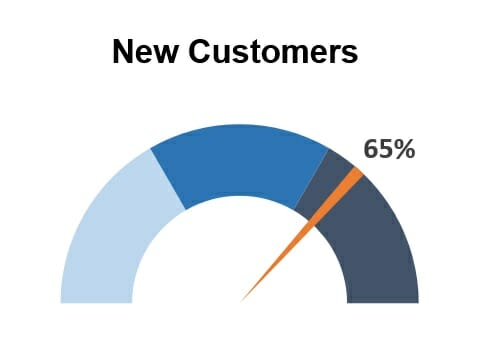
Learn how to create these charts in our course on building an Excel dashboard.
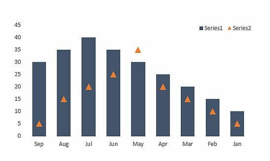
Step 5 – Focus attention
Once the charts are in place it’s very important to focus attention by adding attributes to the graphs. These attributes include arrows, comments, lines, boxes, or anything that pops out from the screen and grabs your attention.
This is one of the most important and yet most frequently overlooked steps in designing a great dashboard.
Here is an example of how to focus attention with a line and a callout.
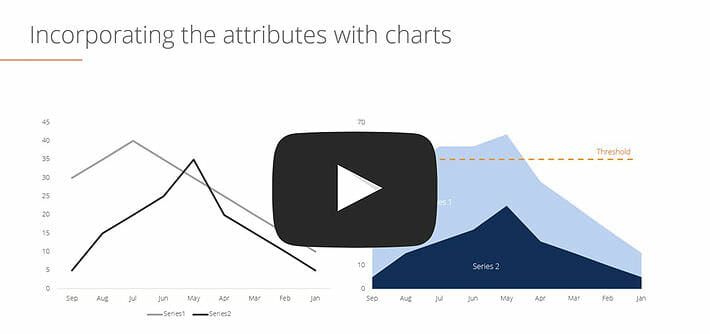
Get this chart now in our course on how to create a dashboard.
Step 6 – Tell a story
The last step is to review your final product and make sure it tells a compelling story. Is it painting the picture you want it to? This is when you step back and take a bird’s-eye view of your data, the key messages, and compare that to the original purpose of the dashboard. If it’s not telling the story you want to tell, consider redesigning it, changing the data, or doing whatever is necessary to get your point across.
More Tools for Dashboard Creation in Excel
We hope this has been a helpful CFI guide on how to build your own dashboard. CFI is the official provider of the global Financial Modeling & Valuation Analyst (FMVA)™ certification program, designed to help anyone become a world-class financial analyst.
Some further reading that could be a big help for you is outlined below in our most popular resources: